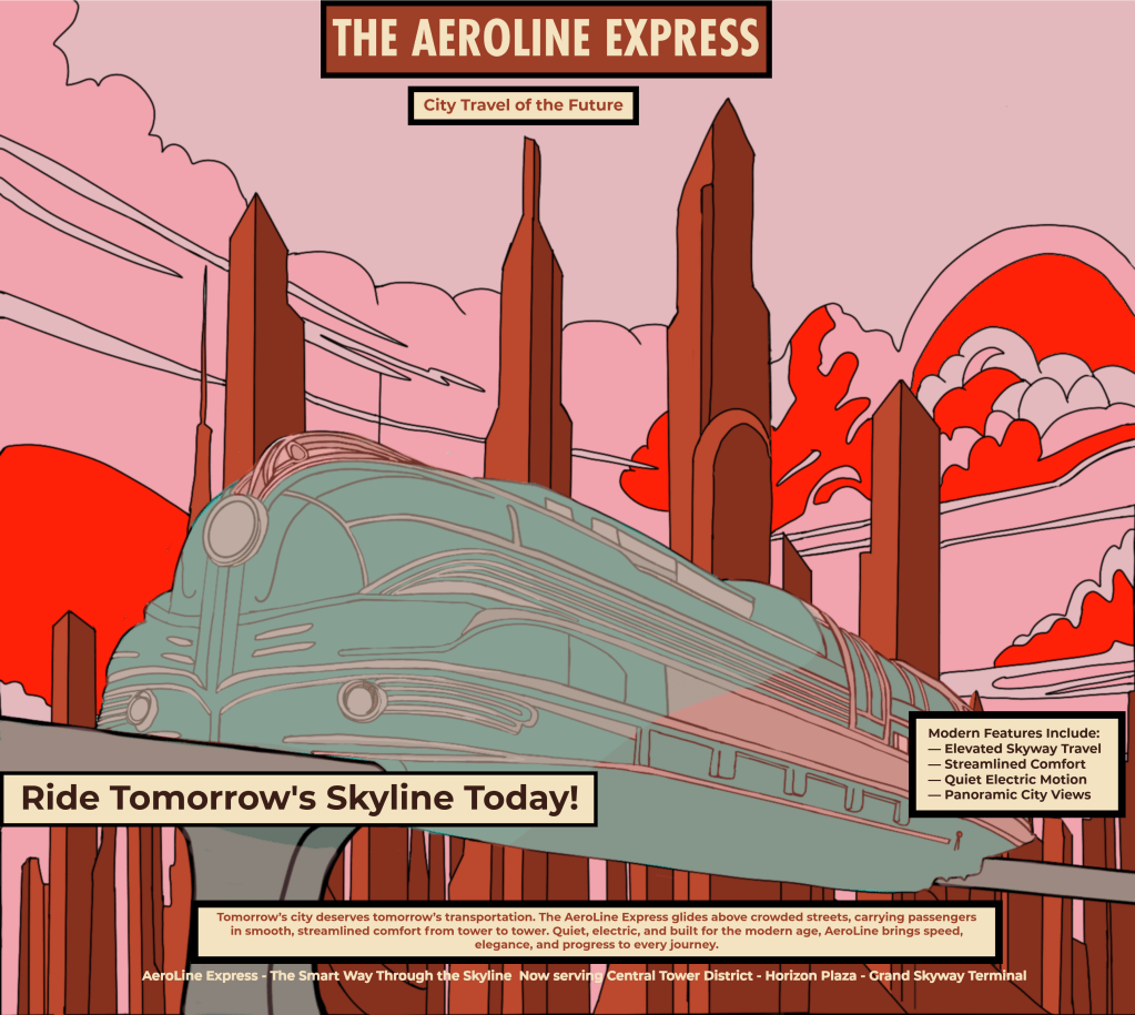
I’ve been playing around with one of my retro-futurist city drawings and tried turning it into a fictional 1950s-style magazine advertisement.
The idea is an elevated transit system moving through a city of Art Deco-inspired towers — kind of like the “future city” people once imagined.
This was mostly a learning exercise in layout, typography, color, and how to make the text fit with the artwork. I’m still figuring out what works and what doesn’t, but this one was a fun experiment.
I’m figuring things out and sharing along the way.

Leave a comment