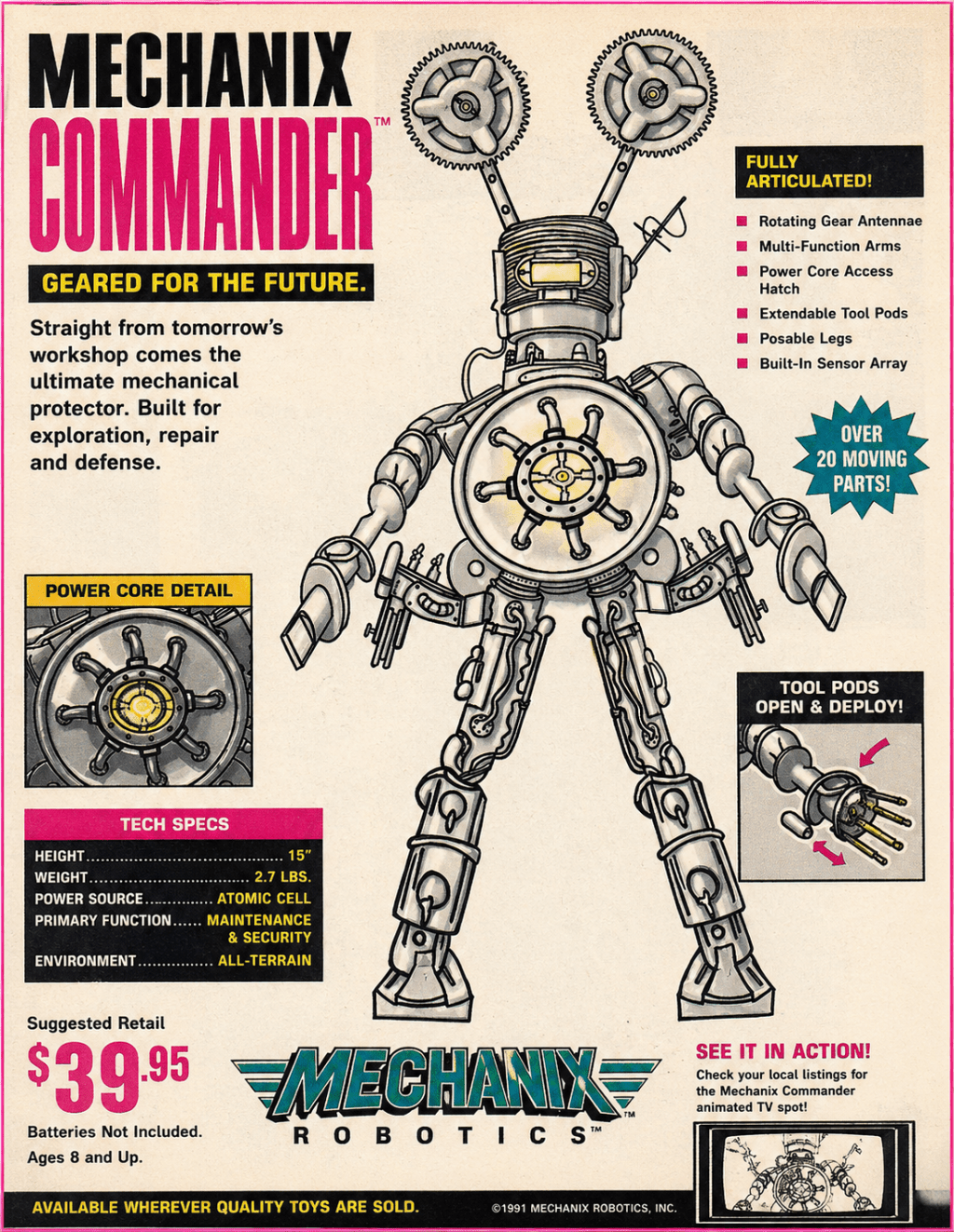
This started as a simple pen-and-paper robot sketch.
I’ve been spending some time exploring that transition period between the late 1980s and early 1990s—where machines still felt heavily mechanical, but design was beginning to shift toward a more digital and stylized look. Gears, exposed components, and solid industrial forms were still present, but there was also a growing sense of “feature-driven” design.
With this piece, I wanted to take that original sketch and imagine it as something you might have seen in a magazine around 1991.
Not just the robot itself—but the full presentation:
- bold headline text
- feature callouts
- exaggerated claims (“over 20 moving parts”)
- and that slightly crowded, high-energy layout
The robot design is my own, drawn by hand.
For the magazine-style advertisement, I used AI as a tool to help build out the layout and overall composition.
This project was less about creating a finished product and more about experimenting with:
- how a design changes when placed into a different era
- how presentation influences perception
- and how modern tools can be used alongside traditional sketching
There’s still a lot I’m learning—especially when it comes to getting the details of a specific time period just right—but that’s part of the process.
If you remember this era of magazines, I’d be curious what stands out to you—what feels accurate, and what could be pushed further.
As always, just sharing ideas.
— Retro Robot Studios

Leave a comment