Experimenting with a Patent-Style Layout
I tried something a little different with this piece.
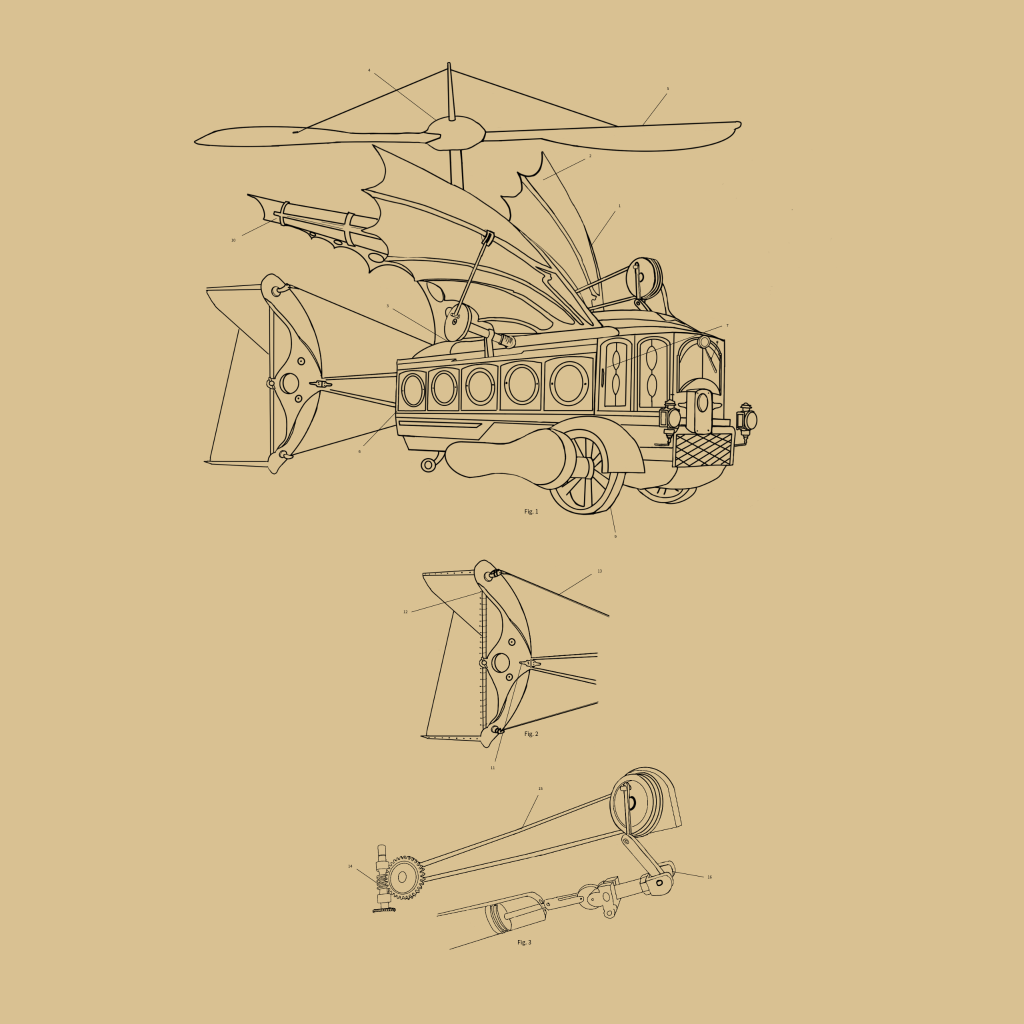
The original idea started as a retro-futuristic concept, but instead of focusing only on the design, I wanted to experiment with laying it out more like a patent-style drawing. That meant paying more attention to figure placement, callouts, spacing, and overall balance.
Going through that process gave me a better appreciation for the draftsmen from that time period. Everything had to be done by hand, and there’s a level of precision and patience there that’s easy to overlook. Trying to replicate even a small part of that approach made me realize how much thought went into something that, at first glance, can look simple.
I went back and forth on whether to add a full title block and written description like a traditional patent. In the end, I decided to leave it off. The layout felt cleaner, and I liked how the drawing stood on its own without anything pulling attention away from it.
Still figuring out where that line is between “finished” and “too much.” This one felt like a good place to stop.
As always, this is part of the learning process—just trying things out and seeing what works.
If you have any thoughts on the layout or approach, feel free to share. Always open to learning from others.


Leave a comment